

5 Coastal Color Palettes for Ocean-Inspired Homes (With LRVs)
Dreaming of a home that transports you to ocean breezes, salty air, and the serene rhythm of the waves? Welcome to the world of coastal color palettes—an interior design favorite that channels the calming and refreshing vibes of beachside living.
Whether you’re redesigning a beach house or simply bringing a splash of the seaside to your urban apartment, choosing the right color palette is key to creating that ocean-inspired atmosphere. This blog will explore the psychology of coastal colors, breakdown popular palettes, and show you how to transform your space into a breezy coastal retreat.
From the deep blues of the ocean to the soft, sandy beiges of the shore, we’ll walk you through how these colors can elevate your home and your mood.
Get ready to ride the wave of inspiration!
This article may contain affiliate links, which means I earn a commission from the sale (at no extra cost to you!). I recommend items that I personally love and believe these products will help you create your dream home.
The Psychology of Color in Coastal Living
Before picking up a paintbrush, let’s talk about the power of color. Did you know the shades you surround yourself with can directly impact your mood and the energy of your home? Here’s how coastal-inspired colors work their magic.
- Blue Shades: From navy to baby blue, this color is deeply associated with calmness and tranquility. It’s no wonder—it mirrors the sky and ocean, creating a sense of openness and serenity. Perfect for living rooms or bedrooms where relaxation is key.
- Beige and Neutral Tones: Think sandy beaches and driftwood. Beige, tan, and soft greys evoke warmth, simplicity, and comfort—ideal for creating inviting common areas like dining rooms or entryways.
- Greens and Aquas: Shades like sea glass green and aqua add vibrancy, resembling lush coastal vegetation or sparkling shallow waters. These colors bring energy to dynamic spaces, such as kitchens or offices.
- White and Off-White: A staple in coastal design, these tones function as a clean foundation, making any space look light and airy—like a blank canvas of possibilities.
Each of these colors not only mimics the natural beauty of the coastline but also brings specific moods and atmospheres into your home.
Popular Coastal Color Palettes and Their Applications
With the psychology of color in mind, let’s explore some key coastal-inspired palettes and how you can use them to redefine different rooms in your home.
For every palette we have added official Sherwin-Williams LRVs (Light Reflectance Value, from 0 for black to 100 for white). In bright Florida light, colors read lighter than on the chip, so the LRV helps you predict how each one will look.
Navy Blue
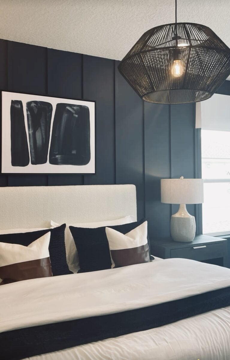
Colors: Naval (SW 6244), Oyster Bay (SW 6206), Pure White (SW 7005), Sea Salt (SW 6204)
| Color | LRV | Role |
|---|---|---|
| Naval SW 6244 | 4 | Accent walls, islands, doors |
| Oyster Bay SW 6206 | 44 | Sage-gray walls |
| Sea Salt SW 6204 | 63 | Airy main walls |
| Pure White SW 7005 | 84 | Trim and ceilings |

Where to Use It: Living rooms, bedrooms
Nautical navy is a timeless palette. The rich navy tones provide a striking contrast against white walls, while touches of gold or burgundy add sophistication. This palette exudes elegance while still staying true to a coastal theme.

Pro Tip: Incorporate navy throw pillows, white linen curtains, and golden decor accents like picture frames or lamps for a polished look.
Alabaster and Soft Blues

Colors: Alabaster (SW 7008), Upward (SW 6239), Spare White (SW 6203), Aleutian (SW 6241)
| Color | LRV | Role |
|---|---|---|
| Alabaster SW 7008 | 82 | Warm white walls |
| Spare White SW 6203 | 77 | Soft white trim |
| Upward SW 6239 | 57 | Breezy blue-gray |
| Aleutian SW 6241 | 39 | Deeper blue accent |
Where to Use It: Open spaces, dining areas, and entryways
There’s something inherently comforting about the sandy tones inspired by dunes and driftwood. Sandy beige creates a warm, neutral backdrop that feels effortlessly inviting. Pair it with soft greys or muted whites for a seamless, natural look in common spaces.
Pro Tip: Add textures like jute rugs, rattan furniture, or woven baskets to enhance the coastal aesthetic.
Lullaby by Sherwin Williams

Colors: Lullaby (SW 9136), Extra White (SW 7006), Slate Tile (SW7624)
| Color | LRV | Role |
|---|---|---|
| Extra White SW 7006 | 86 | Crisp trim and ceilings |
| Lullaby SW 9136 | 65 | Soft blue walls |
| Slate Tile SW 7624 | 15 | Deep blue-gray accents |
Where to Use It: Exterior of the home, nursery, kitchen
Inspired by the calming sound of ocean waves, this palette is perfect for creating a serene and soothing space. The soft grey-blue hue of Lullaby pairs well with bright white accents for a clean and airy feel. Use Slate Tile as an accent color to add depth and interest to the room.

Pro Tip: Incorporate natural elements like wooden furniture or seashell decor to enhance the coastal vibe in your chosen space.
Sea Glass Greens
Colors: Greek Villa (SW 7551), Sea Salt (SW 6204), Rainwashed (SW 6211), Acacia Haze (SW 9132)
| Color | LRV | Role |
|---|---|---|
| Greek Villa SW 7551 | 84 | Warm white trim |
| Sea Salt SW 6204 | 63 | Airy main walls |
| Rainwashed SW 6211 | 59 | Bathrooms and bedrooms |
| Acacia Haze SW 9132 | 32 | Cabinets or accent walls |
Where to Use It: Bathrooms, bedrooms and open living spaces.
Soft sea-glass greens feel calm and natural, and they look right at home with Florida palms and greenery outside the window. Read our Sea Salt and Acacia Haze reviews for more detail.
Sandy Neutrals
Colors: Alabaster (SW 7008), Natural Linen (SW 9109), Accessible Beige (SW 7036), Evergreen Fog (SW 9130)
| Color | LRV | Role |
|---|---|---|
| Alabaster SW 7008 | 82 | Trim and ceilings |
| Natural Linen SW 9109 | 66 | Warm main walls |
| Accessible Beige SW 7036 | 58 | Deeper neutral for adjoining rooms |
| Evergreen Fog SW 9130 | 30 | Cabinets, doors or an accent wall |
Where to Use It: Whole-house palettes, open floor plans and bedrooms.
Inspired by sand and driftwood, this palette feels warm and relaxed. It is a great choice if you want a coastal feel without using blue. See our Natural Linen review for more.
How to Bring Coastal Colors Into Any Space
You don’t have to live by the seaside to enjoy a beach-inspired aesthetic. Here are a few practical tips to help you introduce coastal color palettes into your home.
- Start Small: Test the waters by incorporating coastal colors through accessories like throw pillows, area rugs, or curtains.
- Decorate With Nature: Use shells, driftwood, or sea glass as decor pieces. They not only reflect coastal hues but also add authenticity to your design.
- Layer Textures: Combine cool, crisp colors with natural textures like wicker, linen, or cotton to capture laid-back beach vibes.
- Play with Light: Coastal design is all about airy, sun-soaked spaces. Opt for sheer curtains, light-colored walls, and mirrors to maximize natural light.
- Mix and Match: Don’t shy away from blending different palettes across rooms—just make sure there’s harmony between them.
Transform Your Home with Coastal Colors
A coastal-inspired home is more than just decor—it’s an everyday escape to your favorite place by the ocean. By thoughtfully applying these calming, beautiful color palettes, you can create a space that reflects your love for the coast while making it uniquely yours.
Have you already embraced the coastal look or are you just starting your beachy makeover? We’d love to see your transformations! Share your experience or post a photo in the comments below.
Ready to try a palette? Peel-and-stick samples from Samplize let you test every color on your own walls, and you can find even more ideas in our Sherwin-Williams coastal paint colors roundup.
Frequently Asked Questions
What colors are in a coastal color palette?
Coastal palettes usually combine soft blues, sea-glass greens, sandy neutrals and crisp or warm whites, sometimes with a navy accent.
What is a good coastal navy?
Sherwin-Williams Naval (LRV 4) is a classic navy that pairs beautifully with whites, sea-salt greens and natural wood.
How do I make a coastal palette feel modern?
Use mostly warm whites and sandy neutrals, add one deeper accent like navy or slate blue, and skip literal beach decor in favor of natural textures.
What white works best in a coastal home?
Pure White and Extra White feel crisp, while Alabaster and Greek Villa feel softer and warmer.
Can I use a coastal palette away from the beach?
Yes. Soft blues, greens and sandy neutrals feel relaxed anywhere and pair well with natural wood and woven textures.
How many colors should a whole-house palette have?
Three to five colors is a good range: one main neutral, one trim color, and one to three accents.




My aunt wants to freshen up the look of her home so she can invite her friends for parties after the pandemic. I love your idea of investing in colors that promotes rejuvenation and calmness! Maybe we should find a home exterior painter that can use teal and other colors on her home!