Peppercorn by Sherwin Williams: Unveiling the Charm of this Rich Paint Color
When you pick a paint color like Sherwin Williams Peppercorn, you’re choosing a versatile dark gray that can transform your space. It’s important to understand its unique shade, how light affects its appearance, and how it shifts under different lighting conditions.
Defining the Peppercorn Hue
Sherwin Williams Peppercorn is a deep gray that often appears almost like charcoal. What sets Peppercorn apart are its cool undertones which can sometimes reveal a hint of purple. Unlike some dark grays that have strong blue or green undertones, Peppercorn manages a more neutral stance, offering a sophisticated, almost velvety finish. It’s a bold choice that can add depth and drama to your rooms.
Light Reflectance Value and Its Importance
The Light Reflectance Value (LRV) is key to understanding how a paint color will feel in your space. LRV is a scale ranging from 0 (absolute black) to 100 (pure white), indicating the amount of light a color reflects.
Peppercorn has an LRV which means it’s on the darker end of the scale, reflecting only a modest amount of light. You’ll want to consider this when planning your lighting to ensure your space doesn’t feel too dark.
Peppercorn in Various Lighting Conditions
Peppercorn can look remarkably different depending on whether it’s bathed in natural light or illuminated by artificial light.
In a room with plenty of sunlight, this dark gray can take on a softer edge, with its cool undertones becoming slightly more pronounced. Under artificial light, especially warmer tones, Peppercorn can appear more neutral.
Here’s what you might see in different settings:
- Natural Light: Enhanced cool and subtle purple undertones emerge.
- Artificial Light: Tends toward a truer dark gray, less hint of color.
Keep in mind that the intensity and angle of light will also affect the hue, which means Peppercorn is a dynamic color that invites you to explore its shifting personality throughout the day.
Peppercorn Application Ideas

Sherwin Williams Peppercorn SW 7674 is a versatile dark paint color with blue-gray undertones, perfect for making a statement in various parts of your home. Here are some creative ways to incorporate this rich shade into your living space.
Peppercorn For Walls and Accent Walls
When you choose Peppercorn SW 7674 for your walls, you’re embracing a bold look that can dramatically transform any room. This color works exceptionally well as an accent wall, adding depth and dimension. If you’re aiming for a cozy atmosphere, painting all the walls in this color can create an enveloping feel. For an elegant touch, tie the room together with light-colored decor and furniture to balance out the darkness of the walls.
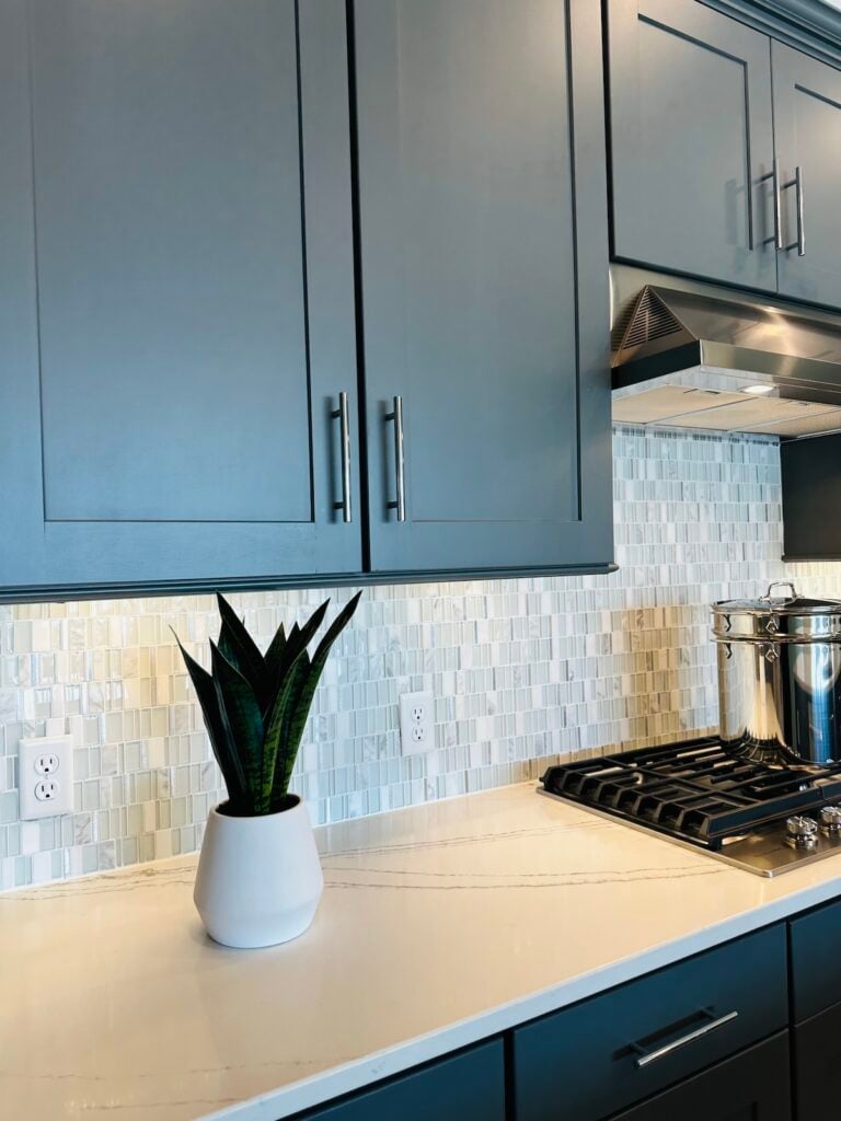
Transforming Kitchen Cabinets
Revamp your kitchen by painting the cabinets with Sherwin Williams Peppercorn. This dark paint color gives your kitchen a modern and sophisticated air. Pair it with stainless steel appliances and a light backsplash to create a visually interesting contrast that’s sure to be eye-catching. Remember, a semi-gloss finish on cabinets is both durable and stylish.
Using Peppercorn on Exterior Surfaces
Thinking about an exterior makeover? Sherwin Williams Peppercorn Exterior paint is an excellent choice for the outside of your home. It’s a strong, yet neutral color that can make your house stand out in the neighborhood. Complement Peppercorn with lighter trim colors or natural wood accents for a look that’s both timeless and contemporary.
Styling Doors and Trim
Your home’s doors and trim are perfect for introducing Peppercorn as an accent color. Whether it’s your front door or interior trim, this dark shade adds an element of sophistication and can be the perfect finishing touch to tie a room’s design together. When used on trim, it frames your space with an air of elegance and works well with neutral wall colors for a crisp contrast.
Coordinating Colors and Comparisons
Exploring the perfect palette to accompany Sherwin Williams Peppercorn can elevate your space, while comparing it to other favorites provides a better understanding of its unique characteristics.
Harmonizing with Coordinating Colors
For a cohesive look, pair Sherwin Williams Peppercorn with complementary shades. Repose Gray is a lighter option that balances Peppercorn’s depth, offering a soft backdrop to its strength. On the other hand, Sherwin Williams Extra White can make Peppercorn pop, providing crisp borders and a fresh contrast. Decorating with Urbane Bronze introduces a warm, earthy quality that syncs well with Peppercorn for a serene and natural ambiance.
Contrasting Sherwin Williams Peppercorn
To create visual interest, consider contrasting Peppercorn with bold and bright colors. Vivid blues or greens can stand against the dark canvas of Peppercorn, bringing life and energy into your room. Metallic accents in silver or gold can also provide a stunning contrast, adding a touch of luxury to the rich darkness of Peppercorn.
Peppercorn vs Popular Alternatives
When weighing Peppercorn against popular alternatives, the nuances of color emerge. Benjamin Moore Kendall Charcoal offers a lighter gray, while Behr Cracked Pepper leans towards a softer black. For those considering a deeper black, Sherwin Williams Tricorn Black is a true black that provides stark contrast, whereas Sherwin Williams Iron Ore is slightly less intense with a similar feel to Peppercorn but offering a slightly different undertone.
- Color Comparisons:
- Benjamin Moore Kendall Charcoal: Lighter gray alternative.
- Behr Cracked Pepper: Softer black.
- Sherwin Williams Iron Ore: Close alternative, less intense.
- Sherwin Williams Tricorn Black: True black contrast.
Interior Design and Decor Tips

When it comes to enhancing your space with Sherwin Williams Peppercorn, it’s all about choosing the right elements to complement this versatile dark gray paint color. Whether you’re picking out furniture or deciding on the palette and accessories, these suggestions can help you achieve a harmonious and stylish look.
Selecting Furniture and Decor
When you introduce Sherwin Williams Peppercorn to your walls, it creates a dramatic backdrop that’s perfect for showcasing your furniture.
Opt for pieces that contrast with this Dark Gray Paint Color to avoid a visual blur. Lighter furniture can pop against the dark walls, but if you want a cozier feel, try warmer tones like deep reds or rich browns.
- Furniture: Choose pieces in light beige, cream, or taupe for a stunning contrast.
- Home Decor: Add texture with woven baskets or a plush rug.
Light-colored decor can prevent the room from feeling too heavy, giving a balanced and inviting ambiance.
Creating a Monochromatic Palette
A Monochromatic Palette using varying shades of gray can be very chic and modern. You might think using different grays could be monotonous, but it’s quite the opposite! Different textures and tones add depth and interest, even when the color palette is limited.
- Start with a base of Peppercorn on the walls.
- Introduce lighter grays through:
- Soft furnishings like curtains or pillows.
- A gray area rug to tie the space together.
- Mix in some white or black items to break up the grays and add visual interest.
Accessorizing with Metallic Finishes
Adding Metallic Finishes such as brass or chrome to your Peppercorn-themed room can add a sparkle of elegance and a touch of modernity.
For example, Brass fixtures against the dark paint create a luxurious and warm feel. Here’s how you can incorporate metallics:
- Lighting: Install brass sconces or a floor lamp for a golden hue that contrasts beautifully with Peppercorn.
- Decor: Choose picture frames, vases, or trinkets in sleek metallic finishes for a stylish pop.
Remember, a little goes a long way with metallics, so use them as accent pieces rather than main features.
Practical Painting Advice

When adding life to your walls with colors like Sherwin Williams Peppercorn, it’s crucial to make informed choices from paint samples to the final touches of trim.
Choosing the Right Paint Samples
Getting your paint samples right is the first step in ensuring your room looks its best. When considering Peppercorn, a rich and dark gray paint color, it’s wise to try out a few samples on your walls.
Since lighting can drastically affect the way a color looks, place samples on different walls that receive varying amounts of light throughout the day.
It can be helpful to compare Peppercorn with a shade lighter than Peppercorn to really see the contrast and decide how dark you want to go.
- Morning light
- Afternoon light
- Evening light
Watch how these samples change in appearance at these different times. This approach will give you a realistic preview of the color before you commit.
Understanding Undertones in Color Selection
Undertones are subtle color tones that can influence the overall hue of your paint.
Peppercorn can be seen as a true gray but in certain lights, it may lean towards a cool or warm color. To really understand the undertones in Peppercorn:
- Look at the color in natural lighting versus artificial lighting.
- Place Peppercorn next to pure white and observe any subtle colors that stand out.
This close inspection ensures that the color will complement your space and decor as you’ve envisioned.
Finding the Perfect Trim Colors
Selecting the right trim color can enhance the overall appearance of Peppercorn.
White trim colors work exceptionally well, adding a crisp, clean finish that makes the walls truly stand out.
Consider using a soft white rather than a stark, bright white, which may create too much contrast. Try these suggested options for a harmonious palette that complements the gray tones:
- Off-white
- Creamy ivory
- Light gray
Sherwin Williams Peppercorn in Digital Media
When you explore home improvement and design online, Sherwin Williams Peppercorn often emerges in digital environments. It shapes your interaction with content and influences marketing strategies.
Influencing User Experience
Sherwin Williams Peppercorn isn’t just a paint color; it’s an element that can affect your overall experience on websites and apps.
Often, designers use the color to create a sense of elegance and modernity, which can make interfaces feel more inviting and professional.
By understanding how colors like Peppercorn influence emotions, digital creators can craft experiences that keep you engaged and comfortable as you navigate the digital space.
If you’ve set your cookie preferences to see more home decor content, for instance, you might notice a trend toward Peppercorn in the imagery used across these platforms.
Knowing its exact RGB values allows designers to maintain consistency across various digital media, ensuring you get the same visual experience whether you’re browsing on a smartphone or a desktop.
This level of detail supports targeted advertising, as analytics show that consistent representation of aesthetic elements like Peppercorn can increase user engagement with advertised home products.
Peppercorn on Social Media
On social platforms, Sherwin Williams Peppercorn has become a backdrop for influencers showcasing interior designs and furniture.
When you see posts tagged with #SWColorLove or see your favorite social media personalities using Peppercorn, you’re observing the color’s role in branding and advertising.
It’s a shade that resonates with users looking for that perfect neutral that complements various decor styles, which means you might see it when browsing for design inspiration.
As you scroll through feeds, you’ll notice how those creamy dark gray tones pop up in sponsored posts and targeted advertising, as companies analyze your engagement with previous similar content – all thanks to analytics and cookies tracking your preferences.
The frequent appearance of Peppercorn in popular posts serves as a visual cue that you associate with quality and style, influencing your perception of the brands and possibly your next paint choice.
Frequently Asked Questions
If you’re curious about matching colors, choosing between similar shades, or using Peppercorn for specific areas in your home, these subsections will guide your decisions and deepen your understanding of this versatile paint color.
What are complementary colors for Peppercorn in a room’s color scheme?
When considering complementary colors for Peppercorn, think about using light greys, warm off-whites, or even muted blues to balance the deep tones of Peppercorn. These colors create a harmonious space and prevent the room from feeling too dark.
How do Peppercorn and Iron Ore differ when used in exterior applications?
Peppercorn has a softer look for exteriors, often displaying a deep charcoal with less intensity than Iron Ore. If you’re aiming for a warm, welcoming exterior, Peppercorn is a great choice. Iron Ore, on the other hand, provides a bolder, darker statement.
Can Peppercorn be a suitable choice for kitchen cabinets?
Absolutely! Peppercorn works wonderfully on kitchen cabinets, especially if you’re going for a modern, chic, or even farmhouse style. It pairs well with different types of hardware and can make a striking impression against lighter walls and countertops.
What are the undertones found in Peppercorn paint?
Peppercorn features subtle undertones that lean slightly towards blue or green, noticeable in certain lighting conditions. These undertones add complexity and visual interest to the color, distinguishing it from a flat black or grey.
How does Peppercorn compare to Urbane Bronze in terms of color depth and warmth?
Peppercorn has a cooler tone compared to Urbane Bronze, which offers a warmer, more earthy feeling with a hint of bronze that provides depth. Peppercorn, in contrast, is cooler and leans more towards the grey spectrum.
In what ways does Peppercorn differ from Behr Cracked Pepper in hue and application?
Peppercorn and Behr’s Cracked Pepper may appear similar, but they differ in their hues and applications.
Peppercorn generally has a softer appearance, which works well in many interior spaces, while Cracked Pepper might be favored for its sharper contrast in specific design situations.