

The 12 Best Sherwin Williams Taupe Paint Colors for Warm, Timeless Rooms
Taupe is having one of those rare moments where it isn’t really having a moment at all — it’s just quietly, stubbornly, refusing to leave. While gray came and went and millennial pink came and went and “greige” came and went and came back again, taupe has been sitting in the corner the whole time, looking quietly expensive, never trying too hard.
That’s the thing about taupe. It does the thing every other neutral wishes it could do: warm without being yellow, sophisticated without being cold, neutral without being boring. After two decades selling homes in Central Florida, the author has watched a lot of trendy paint colors age badly. Taupe is not one of them.
But here’s where most paint guides fall apart — they hand you a list of pretty swatches and call it a day. The actual problem is that “taupe” describes about forty different colors, the undertones can lie to you in person, and Florida light treats paint very differently than the studio photos you saw on Pinterest. So this guide does the unglamorous work the swatch cards skip: the LRV numbers, the undertone gotchas, what to pair with each color, and where each one actually shines.
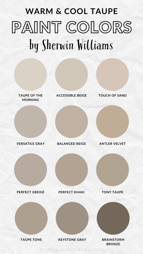
Here are Twelve Sherwin Williams taupes worth knowing, and how to pick the right one for your room.
What Are Taupe Paint Colors?
Taupe lives in the no-man’s land between brown and gray. That’s the official definition. The useful definition is: taupe is a neutral with an undertone strong enough to give a room a personality, but quiet enough to never argue with the furniture.
Every taupe has one of three undertone families:
- Warm taupes — red, orange, or yellow undertones. They read cozy, traditional, sun-soaked.
- Cool taupes — blue, green, or violet undertones. They read modern, calm, slightly more formal.
- Mushroom/balanced taupes — barely-there undertones that shift with the light. The designer favorites, but also the trickiest to sample because they don’t commit to anything.
Florida adds a wrinkle most paint blogs don’t mention. South and west-facing rooms get hammered with a yellow-white afternoon light that pushes warm taupes toward outright peach, and can wash out a soft cool taupe entirely. North-facing rooms — rare and precious in Florida — pull blue out of every paint they touch. If a paint review says “this taupe is balanced,” what they often mean is “this taupe is balanced in Toronto.” Test in your room, in your light, before you commit.
Why Taupe Is a Fan Favorite
What makes taupe so irresistible in home design?
- Timeless Versatility: Taupe shades serve as an ideal backdrop for almost any color scheme, from vibrant jewel tones to soft pastels.
- Warm & Inviting: Taupe’s subtle earthy tones bring comfort and warmth to any room, making your space feel cozy yet elegant.
- Adaptable Aesthetic: It transitions smoothly from traditional to contemporary designs, making it a top pick for both homeowners and professional designers.
Taupe is basically Switzerland in the paint world—totally neutral, impeccably elegant, and harmonious with everything!
What Are Taupe Undertones?
The secret to selecting the perfect taupe is understanding its undertones, which dictate how the color will appear under various lighting conditions.
- Warm Undertones: Subtle hints of red, orange, or yellow make warm taupe shades feel cozier and more approachable.
- Cool Undertones: Slight touches of blue, green, or violet bring a calm, sophisticated tone to cool taupe paints.
- Mixed Undertones: Some taupe shades showcase a mix of warm and cool undertones, offering balance and versatility.
A pro tip? Grab paint samples and observe them in your space both during the day and at night. Natural and artificial lighting can affect how undertones are perceived!
How to pick the right taupe (the five-minute checklist)
Before falling in love with a paint chip, run it through these five filters. It will save weeks of redoing.
1. Check the LRV. Light Reflectance Value (LRV) tells you how much light the color bounces back, on a 0–100 scale. Bright spaces can handle anything. Low-light rooms need an LRV of 50+, or the room turns into a cave. A north-facing dining room with LRV 35 taupe walls will look gloomy by 4 p.m.
2. Identify the undertone. Hold the chip against a pure white piece of printer paper. Whatever shimmer you see — pink, green, yellow, blue — that’s what will show up on your wall, but louder.
3. Match the light direction.
- North-facing: choose warm taupes to fight the cool blue light.
- South-facing: cool or balanced taupes work; warm ones can go peachy.
- East-facing: warm light in the morning, then flat. Forgiving.
- West-facing: brutal warm light all afternoon. Cool taupes survive it best.
4. Sample the actual paint, not the chip. Sherwin Williams peel-and-stick samples or Samplize swatches are wildly more accurate than the tiny printed chip from the store, which is matched to a binder color, not the actual paint.
5. Look at it at 8 a.m., 2 p.m., and 8 p.m. The same wall changes color three times a day. If you only love it at one of those times, keep looking.
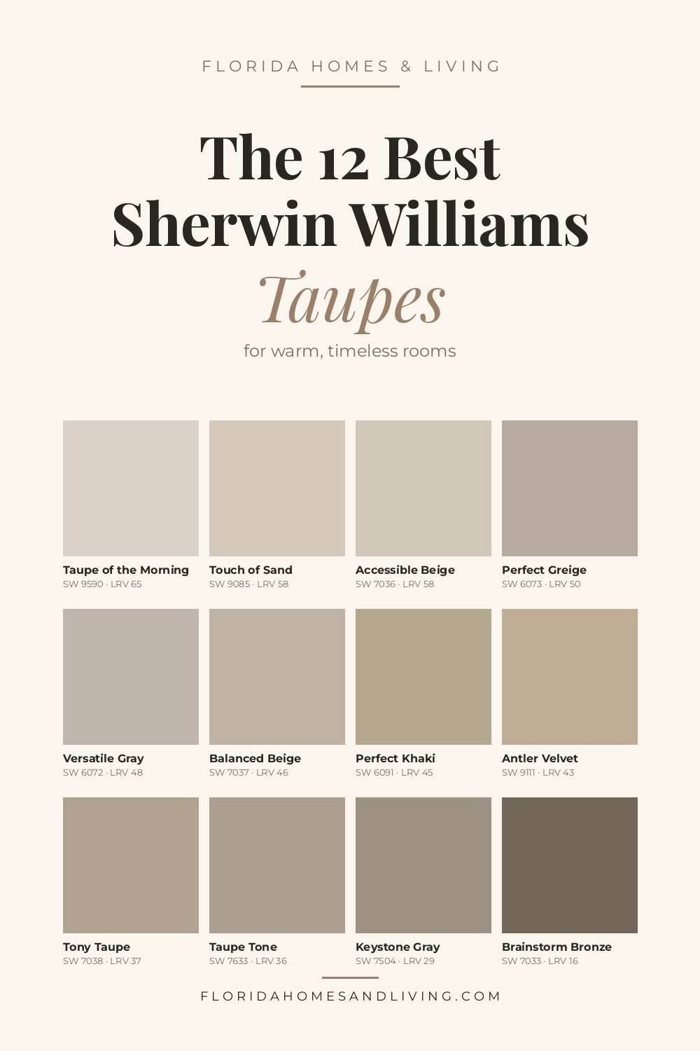
The 12 best Sherwin Williams taupe paint colors
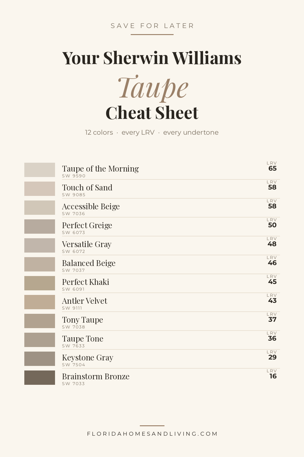
Each color below includes the LRV, the real undertone (not the marketing one), where it works best, and what to pair with it. The colors run from lightest to darkest so you can find the right depth for your space at a glance.
1. Taupe of the Morning (SW 9590) — the airy mushroom
LRV: 65 (Light) · Undertone: soft warm with the faintest gray-pink whisper
This one barely commits to being a color, which is exactly its appeal. Light enough to brighten a north-facing bedroom but pigmented enough not to wash out in bright Florida sun. It reads like the inside of a seashell — soft, slightly warm, never sweet.
Best for: bedrooms, bathrooms, hallways, whole-home neutrals in well-lit homes. Pair with: SW Alabaster trim, natural oak, brushed brass, soft sage accents. Watch out for: in very dim spaces it can go a little dusty.
2. Touch of Sand (SW 9085) — the sunlit pale taupe
LRV: 58 (Light) · Undertone: warm, subtle peach-pink

True to its name, this color looks like Siesta Key at noon. The warmth is gentle enough that it doesn’t tip into pink the way some “warm taupes” do, but you’ll see a slight peachy glow in afternoon light. Beach-house favorite.
Best for: open-plan living areas, sunrooms, beach houses, west-facing rooms that need softening. Pair with: white oak, rattan, linen whites, faded denim blues, terracotta accents. Watch out for: north light flattens it. This one wants sun.
3. Accessible Beige (SW 7036) — the bestseller (and yes, it earns it)
LRV: 58 (Light) · Undertone: warm beige with a steadying gray base
If taupes had a Hall of Fame, Accessible Beige would already be in it. It’s the rare paint that flatters almost every floor it lands above — light oak, dark walnut, gray tile, even travertine — without losing its own personality. Roughly twelve out of every ten designers reach for this one when a client says “warm but not yellow.”
Best for: whole-home neutrals, living rooms, kitchens, exterior siding. Pair with: SW Pure White or Alabaster trim, warm woods, woven textures, cane. Watch out for: in very low-light rooms it can drift toward drab. Wants reasonable natural light to sing.
Show Image homes.with.sarah
4. Perfect Greige (SW 6073) — the diplomat
LRV: 50 (Medium-Light) · Undertone: balanced gray and warm beige; a hint of reddish-brown
The name is not marketing fluff — this one really does land in the exact middle of gray and beige. It’s a touch deeper than Accessible Beige, which gives it a bit more drama on a wall without going dark.
Best for: dining rooms, primary bedrooms, accent walls, transitional spaces. Pair with: creamy whites, rich woods, navy or charcoal accents, antique brass. Watch out for: the red-brown undertone gets stronger in warm afternoon light.
5. Versatile Gray (SW 6072) — the gray that’s actually a taupe
LRV: 48 (Medium-Light) · Undertone: warm greige with beige whispers
The name lies. This isn’t really a gray — it’s a warm greige that pretends to be a gray so it can sneak into modern color palettes. Lovely choice for homes transitioning out of full cool-gray phase.
Best for: home offices, kitchens, modern farmhouses, whole-home palettes. Pair with: black or charcoal accents, white oak, linen textures, deep greens. Watch out for: in north light it can lean a touch cooler than expected.
6. Balanced Beige (SW 7037) — the cozy classic
LRV: 46 (Medium) · Undertone: warm with reddish-brown undertones
This is the color the author keeps recommending for those gorgeous mid-century Winter Park homes with the original wood floors and built-ins. It plays beautifully with warm woods and gives the kind of grounded, lived-in warmth that doesn’t try too hard.
Best for: family rooms, entryways, hallways, traditional and craftsman-style homes. Pair with: honey-toned woods, cream trim, soft greens, copper accents. Watch out for: in bright afternoon Florida sun the red undertone can amplify — sample carefully on west walls.
7. Perfect Khaki (SW 6091) — the unsung outdoorsman
LRV: ~45 (Medium) · Undertone: warm with a noticeable green-yellow lean
Khaki shouldn’t work on a wall. Khaki works on a wall. This is the color that handles the awkward transitional spaces — mudrooms, back hallways, that weird corner between the kitchen and the laundry room. It also looks remarkably handsome on exteriors.
Best for: mudrooms, transitional spaces, exteriors, cottages. Pair with: warm whites, natural stone, sage and olive greens, weathered wood. Watch out for: the green undertone can pop unexpectedly in fluorescent or LED lighting.
8. Antler Velvet (SW 9111) — the warm mid-tone brown
LRV: 43 (Medium) · Undertone: warm yellow-brown, soft mushroom

A deeper, browner taupe that’s been quietly trending in design magazines. It brings genuine richness to a room without going dark — the kind of color that makes a small dining room feel like a wine bar rather than a cave.
Best for: dining rooms, libraries, dens, traditional bedrooms. Pair with: creamy whites, antique brass, walnut, deep forest green, burgundy. Watch out for: in dim light it can read browner than the swatch suggests.
9. Tony Taupe (SW 7038) — the chameleon
LRV: 37 (Medium) · Undertone: subtle mushroom; occasional ghost of green or pink
If a designer ever uses the phrase “moody but not dark,” they probably mean Tony Taupe. The undertones are remarkably restrained, which means it adapts to its surroundings — taking on a warmer glow next to wood, going a touch grayer next to cool stone. Surprisingly good as exterior paint too.
Best for: living rooms with strong light, exteriors, accent walls, primary bedrooms. Pair with: SW Alabaster or Shoji White trim, oak, brass, deep teal or rust accents. Watch out for: it gets heavy in low-light rooms — needs LRV 45+ trim and lots of windows to breathe.
10. Taupe Tone (SW 7633) — the urbane warm-cool
LRV: 36 (Medium) · Undertone: warm with a clear red lean (despite the cool reputation)
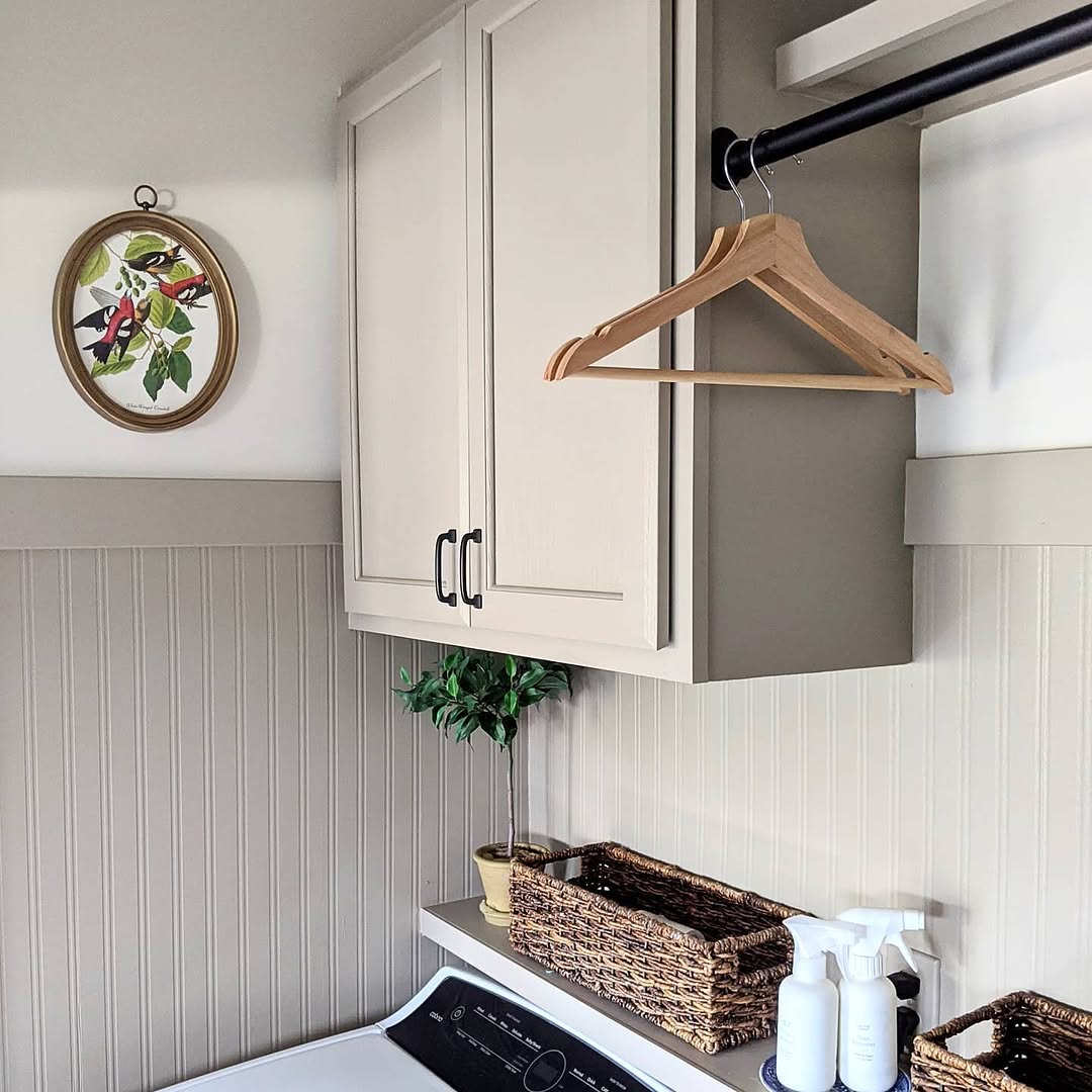
A common myth claims Taupe Tone has blue undertones — that one needs retiring. It actually carries a subtle red undertone that gives it a warm urbane sophistication, which is why it works so beautifully in contemporary city-style interiors.
Best for: contemporary homes, urban condos, dining rooms, sophisticated bedrooms. Pair with: matte black, walnut, marble veining, deep emerald, soft blush. Watch out for: in dim spaces it can go a little muddy. Loves natural light.
11. Keystone Gray (SW 7504) — the dark-greige drama
LRV: 29 (Dark) · Undertone: balanced greige with yellow-brown leaning warm
Here’s where the list shifts from “neutral” into “intentional.” Keystone Gray is the color for a powder room you want guests to remember, or a dining room that needs gravity. Reads gray under cool light, brown under warm — built-in mood swings, included free.
Best for: powder rooms, dining rooms, accent walls, exteriors with white trim. Pair with: high-contrast white trim (SW Pure White), polished nickel, oak, deep brass. Watch out for: needs an LRV 70+ trim color to keep from going heavy. Pair lighting accordingly.
12. Brainstorm Bronze (SW 7033) — the moody hero
LRV: 16 (Dark) · Undertone: deep warm bronze-brown
The darkest of the bunch, and the most opinionated. Use it where you want drama: a single accent wall, a moody library, a butler’s pantry, an exterior front door. It’s the kind of color that turns ordinary spaces into the photograph friends send to each other.
Best for: accent walls, libraries, front doors, exteriors, butler’s pantries. Pair with: bright whites (SW Extra White), aged brass, leather, jewel-tone fabrics. Watch out for: never use as a full-room color in a low-light space unless your goal is “vampire chic.” This one needs contrast.
Quick taupe cheat sheet
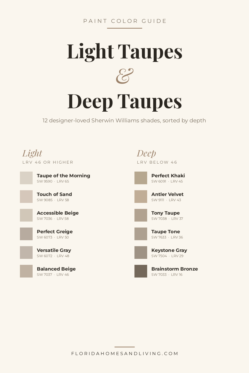
| Color | LRV | Best Light | Mood |
|---|---|---|---|
| Taupe of the Morning | 65 | Any | Airy, soft |
| Touch of Sand | 58 | Sun-facing | Warm, breezy |
| Accessible Beige | 58 | Any with light | Classic, warm |
| Perfect Greige | 50 | Bright spaces | Balanced, refined |
| Versatile Gray | 48 | Any | Modern neutral |
| Balanced Beige | 46 | Sun-facing | Cozy, traditional |
| Perfect Khaki | 45 | Bright spaces | Earthy, transitional |
| Antler Velvet | 43 | Medium-bright | Rich, mid-tone |
| Tony Taupe | 37 | Bright spaces | Sophisticated |
| Taupe Tone | 36 | Bright spaces | Urbane, warm |
| Keystone Gray | 29 | Bright + contrast | Dramatic |
| Brainstorm Bronze | 16 | Accent only | Moody, bold |
Florida-specific tips most paint blogs miss
A few things 20+ years of selling Central Florida homes have taught the author about painting in the Sunshine State:
The pool reflection problem. West-facing rooms with a pool view get blue-green reflected light bouncing off the water in the afternoon. This will make every taupe in your house look a little cooler than it should. Solution: lean half a shade warmer than you think you need.
Tile floors change the undertones. A travertine floor pushes warm taupes warmer; a cool gray porcelain pulls warm taupes toward gray. Always sample taupes next to your actual floor before deciding.
The lanai paint trick. For covered outdoor lanais, the same taupe you used inside will read a full shade lighter outside because of the bounced sunlight from concrete pool decks. Choose one shade darker on the lanai than the adjoining interior room for true visual continuity.
Humidity loves matte finishes, but bathrooms don’t. For Florida bathrooms and kitchens, choose satin or eggshell finishes in any taupe. Matte holds the steam, looks streaky after a year, and pulls down the warmth of every shade.
The designer cheat sheet: which taupe for which room
- Bright south-facing living room: Tony Taupe, Balanced Beige, or Accessible Beige.
- North-facing bedroom that feels too cool: Touch of Sand or Taupe of the Morning.
- Whole-home neutral: Accessible Beige, Perfect Greige, or Versatile Gray (still the safest three picks).
- Drama powder room: Keystone Gray or Brainstorm Bronze.
- Florida cottage or beach house: Touch of Sand or Perfect Khaki.
- Modern condo: Taupe Tone, Versatile Gray, or Tony Taupe.
- Traditional Winter Park or Audubon Park bungalow: Balanced Beige or Antler Velvet.
Final thought
Taupe is the unsexy paint color that quietly outlives every trend, and choosing the right one comes down to two boring questions: how much light does the room get, and what’s already on the floor. Get those two right and any color on this list will work.
If you’re staring at a wall that needs painting and don’t trust your monitor (smart — colors never look quite right on a screen), order the peel-and-stick samples from Samplize and try at least three in the actual room before deciding. Or visit your nearest Sherwin Williams store and grab the real chips.
And if all of this is part of a bigger project — say, getting a Central Florida home ready for sale or considering a move — the author handles real estate across the Orlando area and is happy to talk about which paint colors actually move buyers (spoiler: it’s most of the colors on this list).
📌 Loved this guide? Save these Pinterest pins to your design board so you have the swatch reference next time you’re standing in the paint aisle, regretting your life choices.


