Alabaster by Sherwin Williams: The Perfect Paint for Any Home
When it comes to selecting the perfect paint color for your home, the choices can feel overwhelming. Whether you’re a homeowner looking to refresh your living space or an interior designer seeking the perfect backdrop for a client’s renovation, Sherwin Williams Alabaster continues to be a top choice for many.
Why Choose Alabaster?

This article may contain affiliate links, which means I earn a commission from the sale (at no extra cost to you!). I recommend items that I personally love and believe these products will help you create your dream home.
Versatile and Timeless
Sherwin Williams Alabaster (SW 7008) is not just another white paint. It’s a versatile and timeless shade that complements various design styles, from sleek modern interiors to cozy farmhouse aesthetics. Its unique ability to adapt to different environments makes it a go-to for many designers and homeowners alike.
Warm Undertones
One of the standout features of Alabaster is its warm undertones. Unlike stark whites that can feel cold and clinical, Alabaster adds depth and character to your walls, creating a welcoming and cozy atmosphere. This makes it an excellent choice for living rooms, bedrooms, and spaces where you want to foster a sense of comfort.
Light Reflecting Qualities
Alabaster’s ability to reflect both natural and artificial light is another reason it remains popular. This quality enhances the brightness of a room, making small spaces appear larger and more inviting. If you’re dealing with a room that lacks natural light, Alabaster can brighten up the space significantly.
Durability and Ease of Application
Suitable for DIY and Professional Use
Painting projects can be daunting, especially if you’re a DIY enthusiast. Thankfully, Alabaster’s formulation ensures smooth and easy application, whether you’re using a brush, roller, or sprayer. Its durability also means that your walls will look fresh and vibrant for years to come, making it a practical choice for both DIY projects and professional applications.
Pairing Alabaster with Other Colors and Materials
One of the joys of working with a versatile color like Alabaster is its ability to pair beautifully with other colors and materials. Here are some ideas to inspire your next project:
With Bold Colors
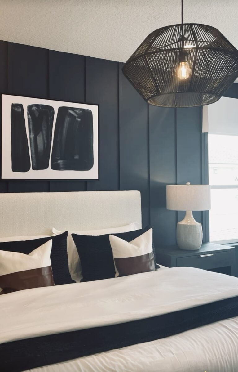
- Navy Blue: Pair Alabaster walls with navy blue accents for a sophisticated and timeless look.
- Emerald Green: For a touch of elegance, combine Alabaster with rich emerald green.
With Neutral Tones
- Gray: Create a serene and calming environment by pairing Alabaster with soft gray tones.
- Beige: For a warmer palette, consider using Alabaster alongside beige or taupe.
With Natural Materials
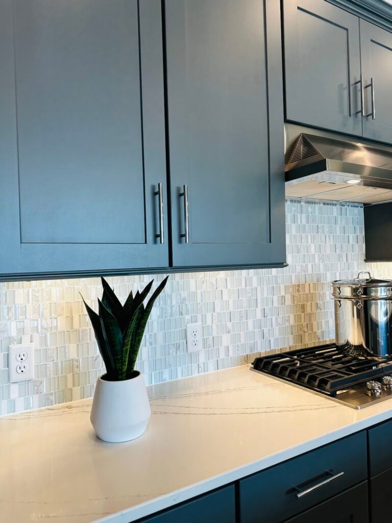
- Wood: Alabaster’s warm undertones complement natural wood finishes, making it an ideal choice for spaces featuring wooden furniture or flooring.
- Stone: Enhance the rustic charm of stone fireplaces or countertops with the subtle elegance of Alabaster.
Color Schemes with Alabaster
Pairing Alabaster with Pure White and Extra White by Sherwin-Williams will really highlight the creamy tones of the shade. This combination works well in modern and minimalist designs, creating a clean and fresh look.
For a more dramatic effect, pair Alabaster with dark shades like Black Fox or Iron Ore. This will create a striking contrast that adds depth and dimension to your space.

Tips for Effective Color Combinations
Creating a harmonious and visually appealing space involves more than just choosing your favorite colors. Here are some tips to help you combine colors effectively:
Consider the Mood
- Calm and Relaxing: Use soft, muted tones like pale blues, gentle greens, and blush pinks to create a tranquil atmosphere.
- Energetic and Invigorating: Opt for vibrant hues such as bright yellows, spirited oranges, and bold reds to energize the space.
Balance Color Intensities
- Pair bright, intense colors with neutral tones to avoid overwhelming the space. For instance, bold red accents can be muted with white or gray backgrounds.
- When using multiple bold colors, ensure they are balanced with plenty of neutral space to keep the look cohesive.
Use the 60-30-10 Rule
- Allocate 60% of the color scheme to a dominant hue, 30% to a secondary color, and the remaining 10% to an accent color. This guideline helps in creating a balanced and visually interesting space.
Test Swatches in Different Lighting
- Colors can look different under various lighting conditions. Test paint swatches on your walls and observe them at different times of the day to ensure they look as expected.
Take Inspiration from Nature
- Nature offers stunning color combinations that are inherently balanced. Think of earthy browns paired with leafy greens or ocean blues with sandy beiges.
Consider the Color Wheel
- Use complementary colors (opposite each other on the color wheel) for a dynamic contrast, or analogous colors (adjacent on the color wheel) for a harmonious blend. For example, blue and orange create a vibrant contrast, while blue and green offer a soothing combination.
Conclusion
Sherwin Williams Alabaster is more than just a paint color; it’s a versatile, timeless choice that brings warmth and brightness to any space. Its ease of application and durability make it suitable for both DIY enthusiasts and professional painters. Whether you’re updating a single room or redesigning an entire home, Alabaster is a color that can adapt to your needs and complement a variety of styles and materials.
Ready to transform your space with Sherwin Williams Alabaster? Visit your nearest Sherwin Williams store to get started. Happy painting!